Showing posts with label learn. Show all posts

Monday, 16 October 2017

Meet Louise De Masi — Special Guest


Louise De Masi


Tell us a little of your beginnings and journey as an artist:


Art was always my favourite subject at school, but back in the early '80s when I graduated high school, there weren’t many jobs for artists, and I had no idea how to pursue a career in art, so I turned my back on it.

However, my love of drawing and painting never went away, and when I was in my 30s, I went to an art studio and enrolled in an acrylic painting class. The owner of the studio noticed my ability and asked if I’d be interested in teaching. That led me to teach acrylic painting classes for about 8 years.

I took up watercolour painting six years ago, shortly after I finished a teaching degree at university. I had given out my resume to some of the schools around my home, and while I waited for the phone to ring for some teaching work, I taught myself how to paint in watercolour. I’m so glad I did because painting in acrylic paint no longer gave me any joy and I stopped painting for a while. Watercolour restored my painting passion.

I taught in schools for five years, and I would paint on weekends when I had time. Half way through 2014, my husband got a job in Sydney, so we moved there temporarily. Instead of approaching schools in Sydney for teaching work, I decided to start painting full-time. I’ve been working on my painting career since then; it’s early days yet. I was reading that it takes five to ten years of full time practice for your work to mature, and years and years to succeed. I know the road ahead will be bumpy, but I am determined and self-disciplined, and I am enjoying the journey.


Antique Rose


Why are you drawn to watercolour and how did you learn this medium?


Watercolour is such a beautiful medium to use. I love to use it for so many different reasons. It’s quick. You can get instant colour on your paper quickly and easily—just wet the paper and drop in the colour. The transparency of the paint allows your painting to glow with light. The effects you can create with watercolour are unmatched by other mediums. It allows you to be expressive or, if you’re like me, you can create highly detailed paintings.

With each painting, I walk the line between competency and total lack of control. It’s an exciting medium to use, and I will be forever under its spell.

I taught myself to use watercolour mainly by looking at other artists’ work that I admire and lots and lots of practice.


Crow


How would you describe your style? We’d love to compare an early painting with a more recent one!


I love detail. I know watercolour is more of an expressive medium than other mediums to use, but it’s the detail that draws me in. I tend to paint loose at the beginning of the painting. I build the painting up with lots of washes, and in the final stages, I add all the detail. Lately, I’ve been adding some deliberate blooms to my paintings, and I’ve been playing with different types of backgrounds to add interest.

I use a lot of water when I work. Even though I like to show detail in my paintings, I still like watercolour to look like watercolour.


Early Kookaburra


Later Kookaburra


In your experience, what are the pros and cons of being a full-time artist and do you ever get creative block?


The greatest part about being a full-time artist is that I get to pursue my passion every day.

Painting gets me up out of bed and keeps me up late at night. I sometimes work 14 hour days, and I’m happy to do it. It doesn’t feel like I’m working most of the time. Being at home is another plus. I have scoliosis and I suffer from back pain. Working from home means I can sit down whenever I want and take a break.

The cons of being a full-time artist are many. You have to have some sort of other income so you can pay the bills. You not only have to be an artist, you have to be a marketing manager and a salesman. You have to spend as much, or more, time promoting your work as you do producing it. Art supplies are expensive, and your days can be lonely.

I rarely get creative block, quite the opposite in fact. I have so many ideas and so many things I want to paint that there are just not enough hours in the day to do it all.


Orchids


What are your preferred art materials?


My favourite paper is Arches. I use both hot and cold pressed.

I use Winsor and Newton and Daniel Smith watercolour paints, and my favourite brushes are Da Vinci.


Bluebird


You offer watercolour painting classes on Skillshare and have just launched your own online school, which is very exciting! Can you tell us more about these classes and what they offer?


I’m very excited about my online classes. Skillshare approached me late last year and asked me if I’d be interested in making some online classes. I’d never heard of Skillshare and teaching online wasn’t even on my radar at the time, but I decided that I’d give it a go in the new year.

I had to learn how to film myself painting and how to edit my videos and add narration. I have five watercolour classes on Skillshare, and I’m working on my sixth now. I have nearly 900 students, and I have received very positive feedback on the classes.

Watercolour can be a difficult medium to use, and I try to simplify the process in my classes. I walk my students step-by-step through various paintings that I have completed, and I provide a reference photo and a line drawing so they can paint along with me. I think a lot of people who first start painting in watercolour have difficulty getting their water-to-paint ratio correct. They either have too much or too little water on their paper or in their brush. Understanding that is the first biggest hurdle to overcome.

My classes have been very successful, so about a month ago I decided to open my own school as well. I have one class in my online school, and I have finished filming my second class. It’s in the editing stages at the moment. Students can pay for the individual classes they want to do in my online school, rather than sign up for a subscription. I’m excited about the journey ahead!

You can visit Louise’s online school here, and her Skillshare classes here.


Yellow Rose


Do you have artists who give you inspiration?


I love the bird paintings of Karl Martens. They are absolutely beautiful. He grew up watching and painting birds. He works with giant Japanese and Chinese paint brushes for his bigger paintings, and they force him to lose control. He uses lots of water, and he makes use of salt to show greater depth. I hope that one day I will master watercolour the way he has.


Pink Roses


What are you currently working on and what will we see next from you?


I’m currently working on a painting of a waratah. I’ve been working on it for 10 days now. It is highly detailed and it’s probably my most difficult painting to date. I’m working on the leaves now, and I’m anxious to finish it because I have other paintings I want to start.

Most of my paintings have a plain white background because I like a simple contemporary look, but I plan to start entering paintings in competitions next year and I feel that I need to begin including some backgrounds and filling in all of the paper. So I think you will start to see more of my paintings with backgrounds. I’ll be painting lots of flowers and leaves.


Waratah work in progress


You can see an image of Louise’s completed Waratah painting here.


What advice can you offer people wanting to learn or improve their watercolour painting skills?


Oh, that’s easy. Take some of my classes!

Use the best materials you can afford. Good quality paper is essential. Don’t be afraid to use water.


Succulent


Follow Louise online:


Website: louisedemasi.com
Etsy: etsy.com/au/shop/LouiseDeMasi
Facebook: facebook.com/louise.demasi
Twitter: twitter.com/Lou_art
Instagram: instagram.com/louisedemasi
Pinterest: au.pinterest.com/louisedemasi
Skillshare: skillshare.com/user/louisedemasi
Online School: louise-de-masi.teachable.com

Thursday, 12 January 2017

learn: how to change posted image using iPhone

There is a new feature for those with an iPhone where you can replace an image on the wall (let's say it was too dark) instead of having to delete the post and re-posting the lightened image.

This is a very handy tool to know about. I have taken some screen shots to help iPhone users learn this simple process.......

STEP: 1
Image is too dark and needs to be replaced with a lightened version. (Learn how to lighten the image HERE)

Click on the arrow to show the drop down box


STEP 2:
Click on 'Edit Post'


STEP 3:
Click on the camera icon. This will allow you to add an additional photo.


STEP 4:
Add your lightened photo and hit 'Save' (you should have two images visible)


STEP 5:
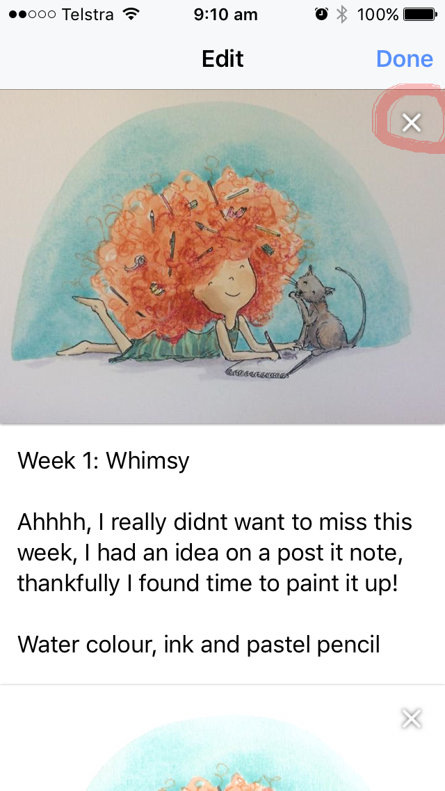
Click on the 'X' of the darker image (the one you want to remove)


STEP 6:
There should only be one image (the lightened image) visible. Click 'Done'.


STEP 7:
Now click 'Save' and your dark image will have been replaced with the lighter version without having to delete the entire post.


Friday, 29 January 2016

learn : repeating patterns with Katharine Harper

Even as a young child I was fascinated by the repeating patterns on fabric and wallpaper—I would look for hours just trying to work out where a single started and finished: and until about 6 months ago they remained a mystery to me. I just couldn’t understand how they worked, and it was seeing some beautiful designs in the 52 week illustration that spurred me into action. My curiosity had to be satisfied!

I found a few tutorials online, some easier to follow than others, but mostly using some very complicated steps and there was plenty of margin for error.  After much exploration of Photoshop and the internet I have found a fail safe way. I am pretty excited about it: no more trying to snap to grids that I may or may not have set up in the right places.

I am gradually getting there, and I love the challenge of taking control over the stripes, diagonals and gaps that appear accidentally or deliberately.

Here are my first few attempts


So that you can see how the process works, I will start by showing you how to create a template for a repeating pattern the old fashioned way – using real paper and ink (with a bit of digital help) and then the Photoshop way.

Finally, if you scroll right to end I will show you how to use your template to actually get it to repeat.
Either way, there are three basic steps:

STEP 1: Basic Pattern

STEP 2: Template

STEP 3: Repeating pattern

The paper way!

Draw your basic pattern in the middle of a square (like in step 1, above).

You are about to cut your design into four pieces: measure your square very carefully. I have drawn cutting lines and labelled the four quarters you can just about see the lines in the photo – please don’t mark your own lovely design on the front.

4. measure your square
Cut it in half horizontally and swap the top half and bottom half.

5. cut

6. swap positions


Cut the design in half vertically (so, cut both pieces in half vertically) and swap them over so that the original design is now in four parts, with the design split up into the corners of the square rather than the middle.

7. rearrange

Carefully, stick the four pieces in place onto some card and fill in the middle of the design, by drawing new elements in the centre, ensuring new parts of your design do not touch the edges. You can see that I added new elements like the seaweed that were not in the basic design.

8. stick together

You have made your template! (step 2, above) Using a photo copier (or tracing paper) you can make multiple copies which will seamlessly match and entwine.

I, however prefer to go digital at this point. Scan your completed design and upload it to Photoshop. The joins (and my guidelines!) showed in the scan so I tidied this up in using the healing tool.

9. Healing tool to tidy up edges
Now read ‘The Photoshop way’, or skip to ‘Using your template as a pattern’

The Photoshop way!

My first attempts at making repeated patterns in Photoshop involved copying layers, making selections and transposing them so that they would snap to grids. I would get confused with which layer was which, where each part started and where it was going.  When I discovered this new way of working, it was like a eureka moment. I have no idea how long it has been lurking there but if you dig around long enough, it’s amazing what you can find.

Now, what you have been waiting for! Making repeated patterns *easily* in Photoshop.

Draw your design in the middle of a square, just as in the paper and ink example, above, and upload it.

Create a new file in Photoshop. I made this one 1000x1000 pixels and 180dpi - you can experiment with different sizes another time

Rename the file: rockpool1

Copy and paste your design into this file (Alternatively, draw your design in this file using the brushes – no need for paper and ink at all!)

I have left this design black and white, but now is the time to add colour if you want to use it.

The background is white at the moment but we need it to be transparent:
Use the magic wand to select the white part of the design; delete the selection : Edit > cut (cntrl X on PC). Then deselect.

10. magic wand

11. deselect

Rename the layer (currently background): centre
Duplicate the layer and name it: wrap

12. duplicate layer

13 wrap


This is totally the best bit! We are about to break up the design and move it around just as we did with the paper version, but this will be so quick and easy you won’t believe your eyes.
Hide the ‘centre’ layer and make ‘wrap’ the active layer.
Go to: filter > other > offset

14. Offset


We need to cut the file in half and 500 is half 1000 -  remember we made the file size 1000 x 1000 pixels? 

Set the horizontal (pixels right) to 500, and vertical (pixels down) to 500

15. wrap around

16. change size to half


Select OK—and get excited (I did at this point; I hope you do too).
Take another breath… make layer ‘centre’ visible, and grin from ear to ear!

17. make centre layer visible (click on the eye)

Are you ready for some finishing touches?

In the paper version there was a large space to fill in, in the centre. Using the Photoshop method that middle space is filled with the basic design but there will be some odd looking gaps to fill in.
At the risk of teaching my grandmother to suck eggs, here’s what I did:
Use the polygon select tool to select parts of the design.

Make sure the ‘centre’ layer is active (NOT how I have it in the picture, sorry!)

18. use polygon select tool to select part of the design


Copy and paste the selection. The pasted selection will form a new layer: the new layer, by default, becomes your active layer.

19. copy and paste your selection


Move the selection into a space:  Edit > free transform (Ctrl + T)

20. Free transform

Copy, paste and move several parts of the design in this way, remembering to go back and make the ‘centre’ layer active each time. Play around with each selection— change the size, erase parts etc to add variety to the composition.

21. fill the gaps

When you are happy with the design, flatten the layers. This is your template.

22. Flatten the layers

Using your template as a pattern 

Congratulations, if you are still with me, it’s been a long winded tutorial!

FINALLY…you are now ready to save your design as a pattern template.

Go to: edit > define pattern

Name your pattern, in my case: rockpool1

23. name your pattern

Now you can use the pattern, with no worries. The design will line up perfectly and there will be no messy edges to clean up. It’s brilliant, isn’t it?

Here’s how to make that last little bit of magic happen:

Create a new file MUCH bigger than your pattern size (at least twice the height and width)

24.  create a NEW file much bigger than the template

Select the bucket fill tool

25. Select bucket fill tool
On the top menu change the option from ‘foreground’ to ‘pattern’

Click on the button to the right of the ‘pattern’ box and scroll down to select your new pattern. It will be the last in the list.

26. select your new pattern

Ready? When you click the bucket tool in the new file your design will magically fill the space. YAY!!

27. fill you new file

Sit back, feel smug and smile J

Follow Katharine online:

BLOGhttp://katharines-creations.blogspot.co.uk/?m=1

FACEBOOK: https://www.facebook.com/katharinescreations

Friday, 15 January 2016

learn: collage with Anne L-y So

Evolution of a collage...Bear, Moose, and Warbler

"Bear, Moose, and Warbler" is a current work in progress.  In fact, none of the pieces have actually been glued down yet. So the shifting and organic progress can continue until I find a scene I want to keep.  Sometimes, I have a hard time committing to a final image so I don't adhere everything but use photographs of the scene to develop an illustration.  I store the left over pieces in a ziplock or envelope in case I decide to adhere it all later or reuse elements from the scene.

Collaging for me is a very organic process.  It changes, evolves, and changes again.  I tend to come up with ideas, move elements around, remove things, add things, and accept surprises as they come.


Stages of making "Bear, Moose, and Warbler

Step 1.  Find magazine pages that fit colour scheme.

Step 1


Step 2. Cut out some elements and hand tear pieces for collage.

Step 2


Step 3. Draw characters with fineliner and paint with Watercolour. Cut out leaving a white border.

Step 3


Step 4. Layout elements of collage. Take photograph.

Step 4


Step 5. Isolate portion of image for illustration and use photo editing in Snapseed and or Lightroom.  In this case I chose a vignetted border on Snapseed using an iPad.  I like this composition but, I am not 100% satisfied with the lighting in the trees, as there is a lot of reflection.  This sometimes happens when using glossy magazine paper.

Step 5


Step 6. Reassemble collage and photograph.  In this photograph, there is a round glow on the top which is the overhead light reflected on the paper. I tried to place just above trees on the lighter side of the branches.  The paper I used was old photographic paper so it has a natural sheen. Unlike the reflection in the last photograph, this is more appropriate to the scene and well placed.

Step 6


Step 7. Isolate the illustration and edit to achieve a desired look.  In this case I used glamour glow in Snapseed using an ipad and a controlled vignette in Lightroom using a Macbook Pro.  I prefer the outcome of this image more in terms of the reflection but might continue to play more with this image.

Step 7


Step 8.  a)Glue down to page.  Use puffy stickers for characters to let them pop out of page. b) Or reset the scene and start again. c) Store pieces until next time.

Step 8


Follow Anne L-y So online:

Website: http://annelyartandillustration.blogspot.ca/